 |
|
|||||||
|
|


 |
|||||||||
|
|||||||||
 |
 |
||||||||
 |
|||||||||
|


|
|
|||||||
 |
|||||||||

 |
 |
 |
MAKING OF...(page 2) |
||||||||||||||||
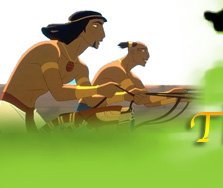
REBUILDING A LOST EMPIRE The setting of "The Prince of Egypt" is divided into two major worlds: the majestic empire of the Egyptians, hewn from stone with clean hard edges and sharp angles; and the small, winding, intimate milieu of the Hebrews, made with mud bricks and timber and worn by the elements. This stylistically different approach helped underscore the contrasts between these two cultures. "I designed the Egyptian world to be larger than life," says production designer Darek Gogol. "When you go to Egypt and stand next to the actual temples, you realize that for ancient people, these were the skyscrapers of their time. What's amazing is that in the 20th century, we're still overwhelmed by this architecture. I wanted to make the buildings bigger than they actually were to capture that sense of scale on the screen." During his research, Gogol found another way to connote the Egyptian style of architecture. "All the ancient Egyptian drawings I studied are flat; they didn't know about perspective," he remarks. "I thought it would be interesting to take that element and draw the architecture in a very flat way without showing any vanishing points. The columns, for example, have no ellipse. They get bigger or smaller as we get closer or farther away, but they remain flat." In sharp contrast to the splendor of the Egyptian Empire are the modest dwellings of the Hebrews in Goshen. Art director Richie Chavez notes, "The world of the Hebrews is more organic. We gave Goshen more of a rounded, eroded look because the homes were made of mud brick, which is weathered by the rain, the wind and the sand. The homes are asymmetrical and off-kilter to give them a flow and ebb that the angular Egyptian side didn't have." A similar split extended to the design of the people who inhabit these worlds. Character designers Carter Goodrich and Carlos Grangel studied ancient wall paintings and carvings to find a visual language that would help define the two societies. The Egyptian characters are more sculpted in appearance with chiseled features, while the Hebrews are more curved and looser in their shape. In creating the faces, the character designers, along with lead animator William Salazar, hit on an approach that further set their characters apart from those in other animated films. Standard practice had been to divide the faces into thirds: one third for the eyes and forehead, one third for the nose and cheeks, and one third for the mouth and chin. In "The Prince of Egypt," the familiar 33-33-33% formula was altered to 30-40-30%. Slightly elongating the middle section of the face and shortening the upper and lower ones gave the characters a more realistic and engaging countenance, and allowed the animators to bring out more expression in their faces. The designers also utilized color to accentuate the contrasts between the two cultures. The buildings of the Egyptians are in polished white and light pastels, while the homes of the Hebrews are in muted earth tones. Their costumes also reflect these color separations. The Egyptians are dressed in white with jewelry accents of gold, red and turquoise, while the Hebrews are clothed in natural shades of brown and beige. Only the Midianites, the desert tribe of Jethro and Tzipporah, are dressed in vibrant colors. "The Prince of Egypt" is the first animated film to employ a professional costume designer. Kelly Kimball worked closely with the character designers to create a "wardrobe" for the characters. She did extensive research, and also experimented with fabrics and natural dyes that were available in the time of Moses. She discovered that the people of the day would have been able to achieve a full palette, which opened up the range of colors that could be used in the costumes. Color became integral not only to the look of the film, but the impact of the drama. During the development phase, the filmmakers worked with the art directors to map out what became known as the "emotional beat board," which assigned specific color schemes to different points of the story. "There are color cues we all respond to naturally," art director Kathy Altieri explains. "We played on those throughout the film. The happier sequences, for example, have lighter brighter colors with lots of sunlight streaming through. We applied red and black for more dramatic, scary or violent sequences. We used blue, a soothing color, in the scene when Moses' basket floats into the Queen's water garden to emphasize that something nurturing and safe is happening." Lack of color also came into play. "The sequence of the death of the first-born is almost monochromatic. Whereas we had used color saturation to fill a scene with life, to express lack of life we literally sucked the color out. We helped convey the emotions of the story through color, light and contrast, but it should be very subliminal. If the audience becomes consciously aware of it, we didn't do our job well," Altieri states. In animation, there is no set, so every sound has to be created from scratch, just like the visual elements. Award-winning sound designers Lon Bender and Wylie Stateman worked for over two years to develop the sounds of ancient Egypt, modulating the frequencies of the background noise in relationship to the action. The Red Sea sequence, for example, demanded that they give volume to the crashing waves without competing with Hans Zimmer's score. They did this by keeping their frequencies out of the range of the music, allowing the sound and the score to be harmonious. In the final step, re- recording mixers Andy Nelson, Anna Behlmer and Shawn Murphy wove together the sound effects, the music and, of course, the voices.
|
||||||||||||||||


 |
 |
 |
 |
|||||
 |
 |
||||
|
|||||


 |
|||||
|
 Buy DVD  Buy Posters |
|
|||
|
|||||


